Graphing Calculator
Lorem ipsum dolor sit amet, consectetur adipiscing elit. Sed do eiusmod tempor incididunt ut labore et dolore magna aliqua.
Category:
Technical Design
Company:
Microsoft
Duration:
1 Year
Location:
Seattle, WA
Date:
May 21, 2024
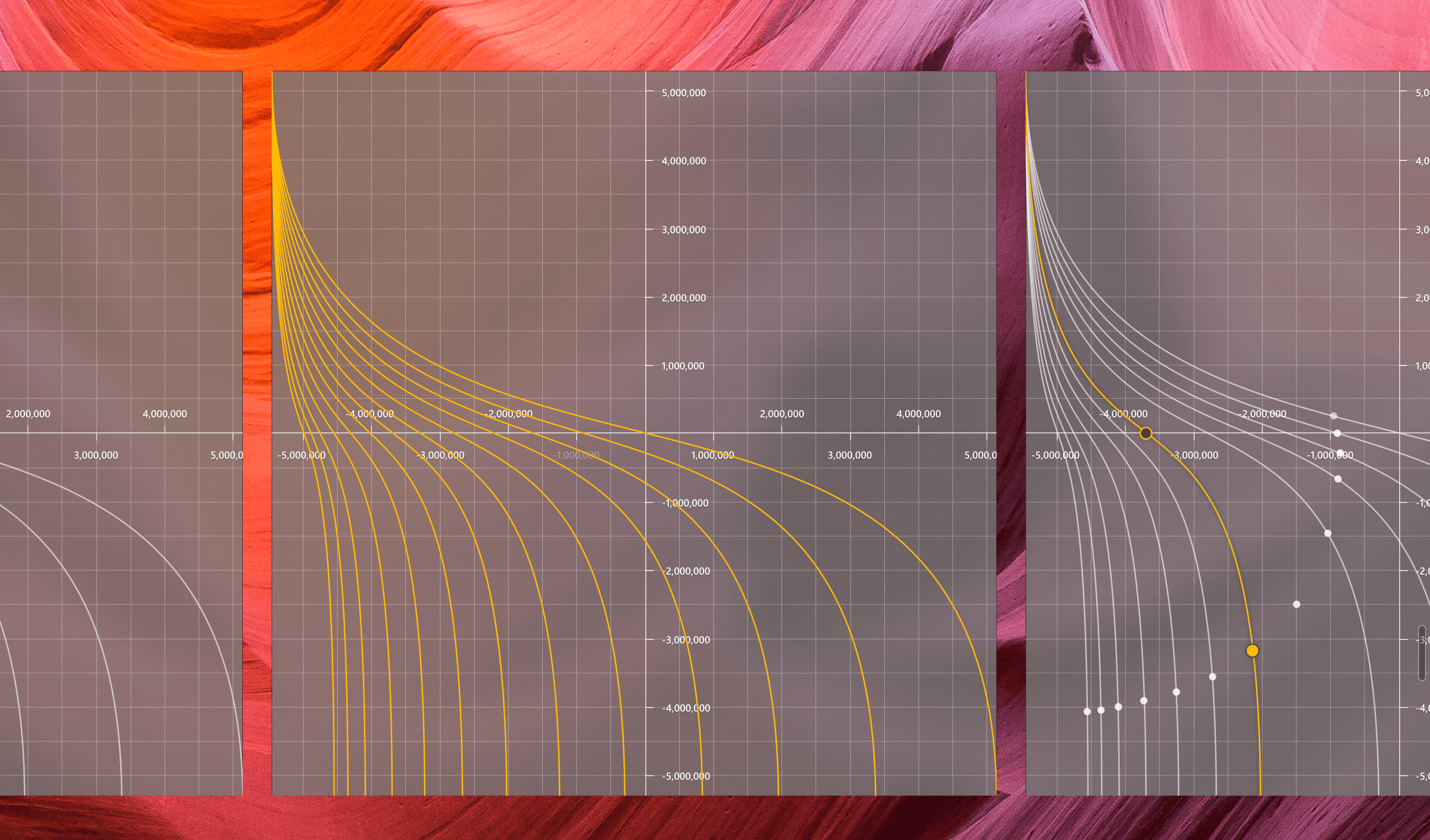
What does graphing look like in the calculator everyone already has?
Windows Calculator has 40M+ daily users. Students learning algebra were reaching for a separate graphing tool or a handheld calculator to see what an equation actually does. I joined the Windows team to define and design graphing mode (the user needs, the scope, and the experience) inside an app that had to stay fast and familiar for everyone who just wants to add up a receipt.



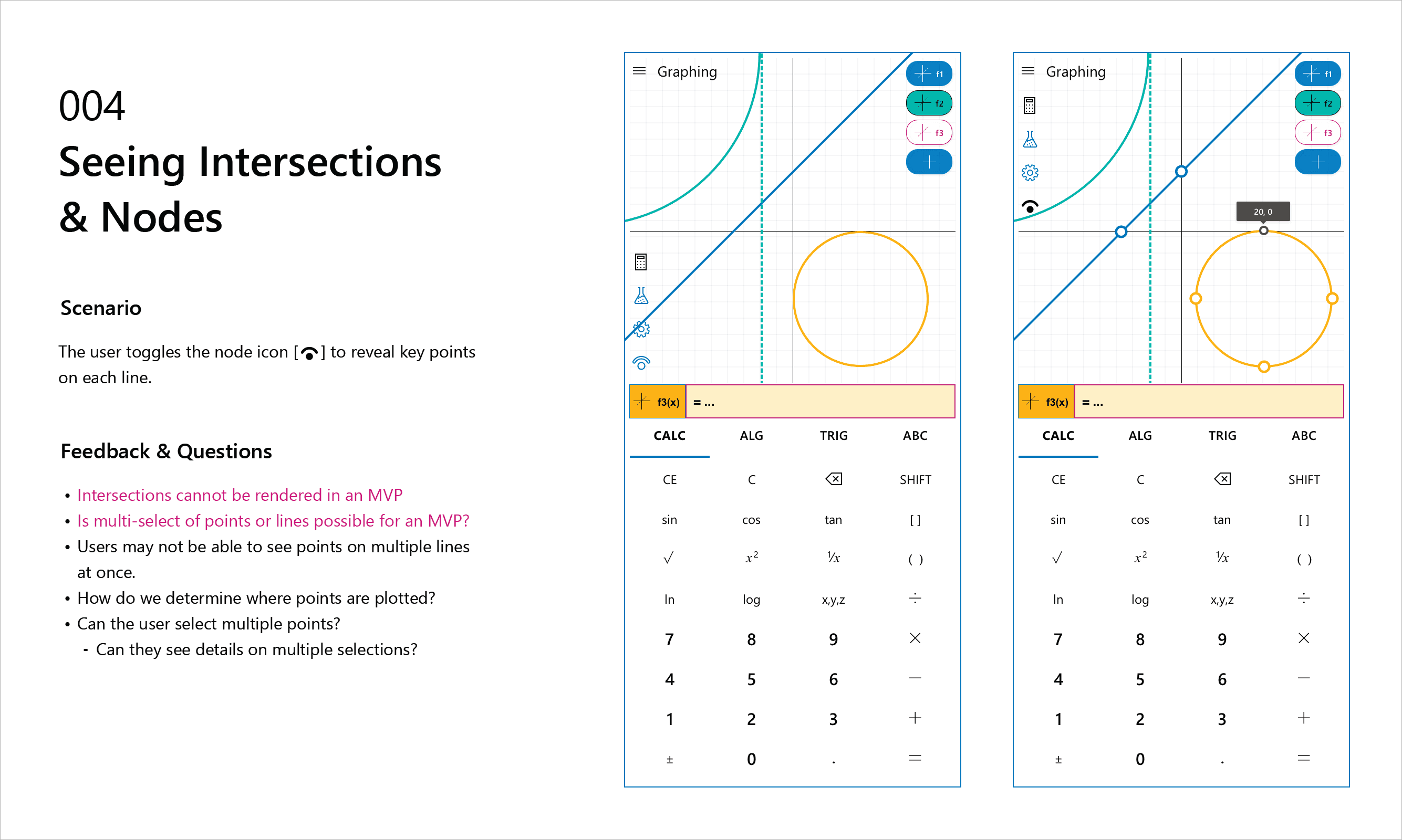
Scoping for the classroom
I started with who graphing was for: students working through algebra, and the teachers guiding them. That set the scope: plot several equations at once, change a variable and watch the curve respond, and read the key features of a function without leaving the graph. I worked with PMs and developers to set timelines and cut the list to what would make a first release genuinely useful, rather than a feature-for-feature copy of a dedicated graphing app.
Design that explains the math
Graphing had to feel native to Windows and stay accessible, so I documented accessibility behavior for engineering alongside the visual design. I also designed the motion: how the graph loads, how lines draw as vectors, how controls respond on hover, and how panels show and hide. The rule was that movement always points at what changed in the math, never at the interface itself.

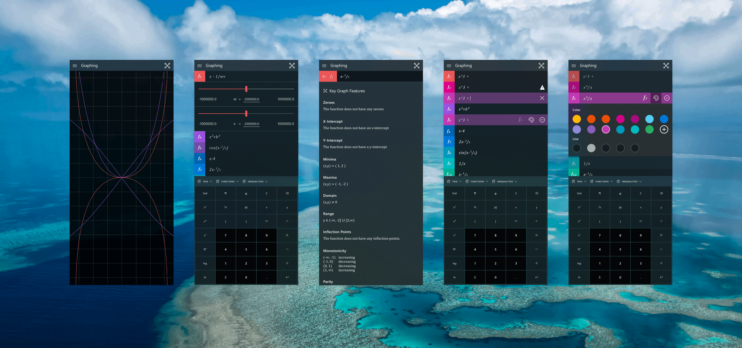


Graphing, built into Windows
Graphing mode shipped in Windows Calculator [year], putting a graphing tool in front of students who already had the app installed. The feature now has 5-10 million users daily and is utilized in classrooms around the world.
The redesigned calculator as a standalone app has 40 to 50 million daily users, and continues to be a staple of the Windows ecosystem.


